Rox Records
Brief
Inspired by the brand “Rox Records” I created for one of my design courses, I transformed my ideas into a mobile app interface. The app connects both friends and strangers through music, provides forums and spaces to communicate and review tunes, and shows users nearby concerts of artists they've liked.
Type
UI/UX, Mobile Application & Brand Identity Design
Medium
Figma, Adobe Illustrator, Adobe Photoshop
Background and Brand Design
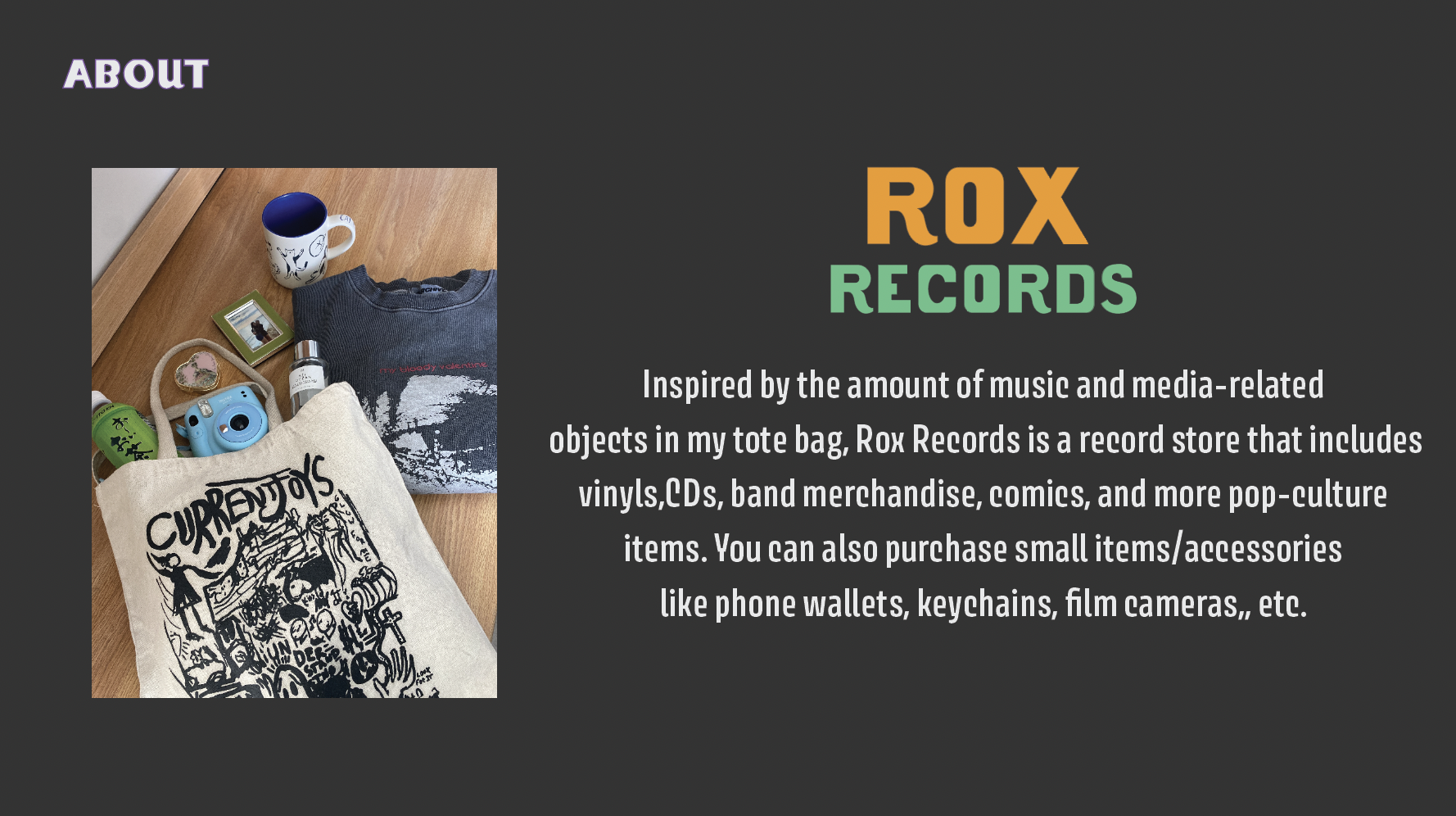
In Spring 2022, I was tasked with creating a personal brand that connected to my identity for the class ARTG1250 Design Process Context Systems. I decided to create the brand Rox Records, in honor of the media and music-related objects I own and love. All designs and logos were created by me through Adobe Illustrator and Photoshop.View my final brand presentation below!

Planning and Sketches
When I began transforming my ideas into an app, I first created a list of all the features I wanted the app to have.
This included most functions and abilities users should have, along with each main screen (home, music explore, friends, profile).
I wanted the app to include embedded content and plugins like Spotify and Youtube for ease of access when listening to songs, pressing shared links, etc.
This included most functions and abilities users should have, along with each main screen (home, music explore, friends, profile).
I wanted the app to include embedded content and plugins like Spotify and Youtube for ease of access when listening to songs, pressing shared links, etc.
Then, to have a consistent visual guide with me, I drew a rough sketch of the first four main screens I wanted to create.
This sketch would help me loosely follow a certain layout I wanted the app to have.
This sketch would help me loosely follow a certain layout I wanted the app to have.
Process
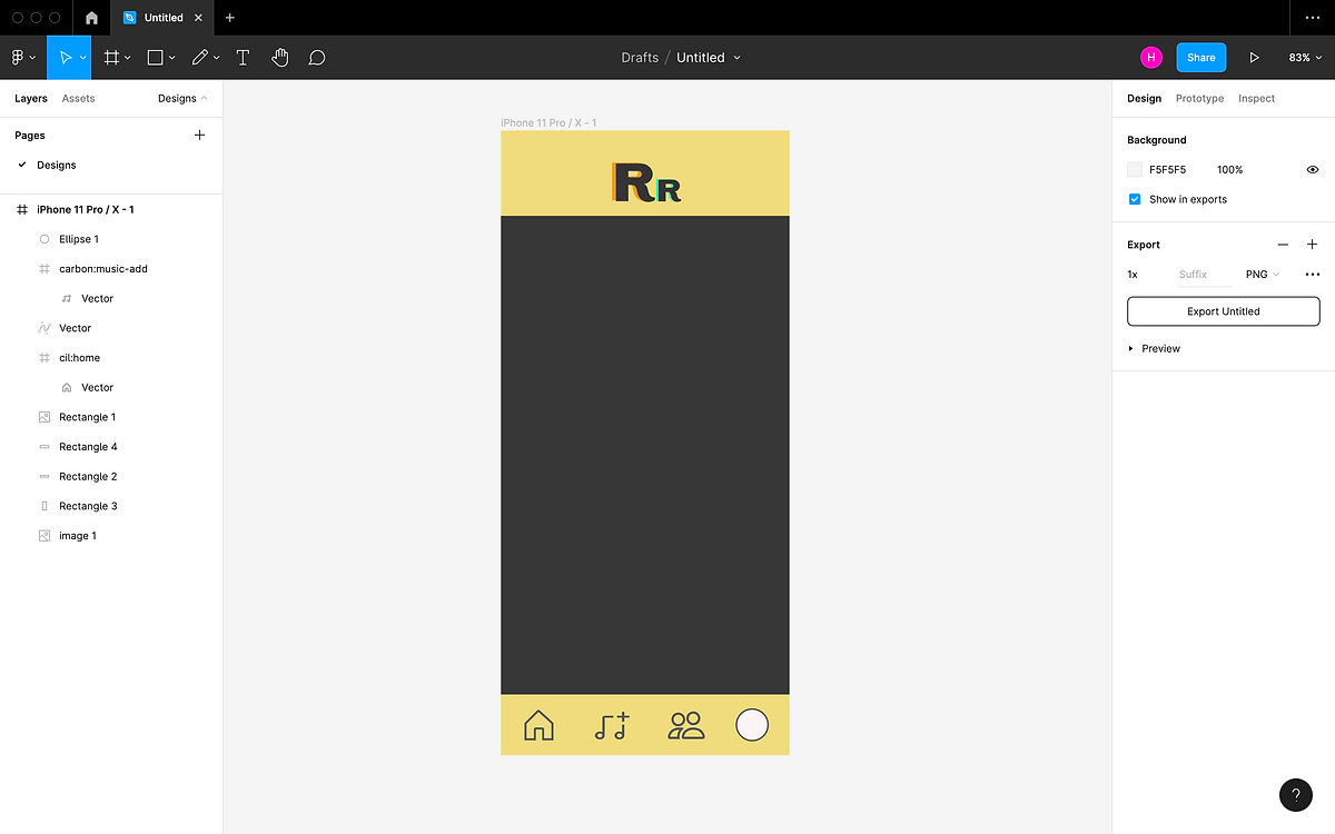
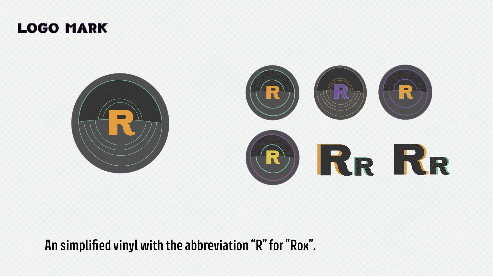
When creating the background and general form of the app, I decided to stick with one of the simpler logo marks I had made in the original brand design, for the user's ease of looking at it. I chose the "RR" to emphasize the brand's name and imported it through Adobe Illustrator. I used various plugins through Figma for the icons at the bottom.
Though they were secondary colors in my original brand design, I chose a muted yellow and off-black for the main colors since I wanted the app to look cleaner and use fewer colors than I had originally intended in the brand design. The bright neon teal would be too harsh and bright on users' eyes, and orange is usually not a strongly favored color for users.
Though they were secondary colors in my original brand design, I chose a muted yellow and off-black for the main colors since I wanted the app to look cleaner and use fewer colors than I had originally intended in the brand design. The bright neon teal would be too harsh and bright on users' eyes, and orange is usually not a strongly favored color for users.
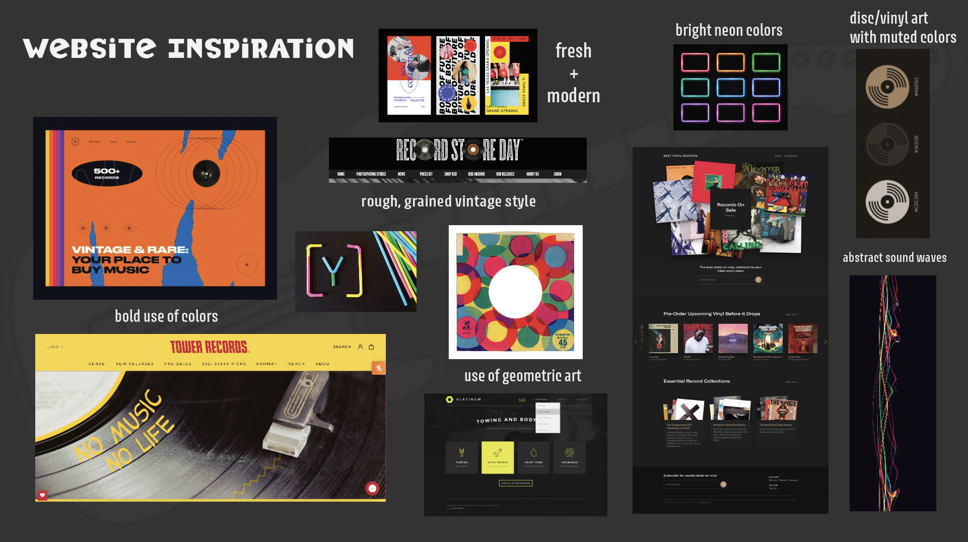
I did not want the app to look too clean or simple since after researching some existing record stores and labels, their websites were on the much more "punkier" side of design and utilized many darker colors, with the occasional pop of neon color. However, I decided against the use of too bright neon colors since it would appear harsh on users' eyes.
Regarding fonts, I stuck with Avory I Latin (my secondary font in the original brand design) since it offered that more edgy feeling to the app. The first font, BadTyp, was too much of a complex and "loud" font to be used throughout the app.
For body text used in messages, text posts, and comments, I used Open Sans, an easy-to-read and user-friendly font.
I used rounded rectangles and squares for most of the app for aesthetic purposes and to add a more friendly, press-able energy to the posts and buttons.
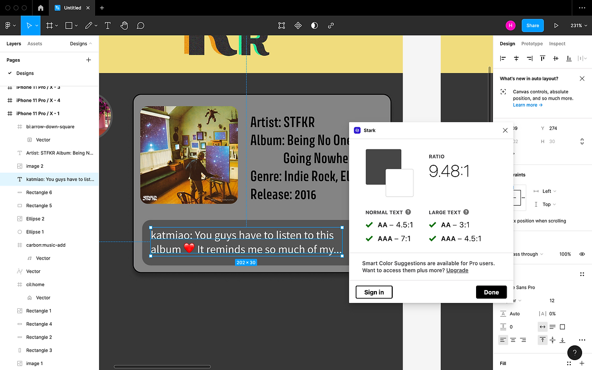
While creating the mock posts, I used a plugin Stark to double-check that the contrast of text to background was balanced well.

Initial Design of Home Page
Home Page:
I had already noticed some issues with this design:
I had already noticed some issues with this design:
- In the top post, I made the "read more" arrow icon orange, which made it appear as more of a primary action. It also may read to users as a "download" icon in that color.
- Stroke along post containers was harsh, making the design appear a bit juvenile and not as sleek.
- No function/button to create a new post.
- No help bar/button in case users had trouble with the app.
- No like or comment features on posts. This inhibits users' ability to interact with each other and could lead to the app having lower user engagement.
Refinements and Other Screens
Second Design of Home Page
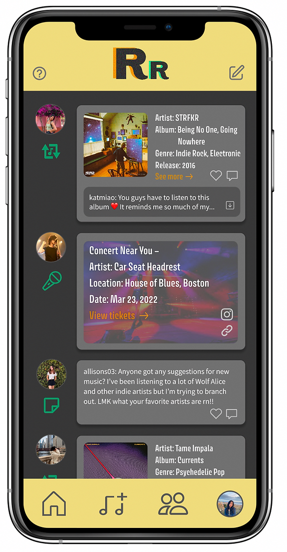
Home Page Pt. 2:
I fixed issues from the initial design like lowering the stroke and adjusting some colors, while adding more features, including ones I specified in my initial review.
Details and Functionality:
I fixed issues from the initial design like lowering the stroke and adjusting some colors, while adding more features, including ones I specified in my initial review.
Details and Functionality:
On each screen, there is a help button that leads to another screen that includes FAQ, tutorials, purpose of the app, information about the Rox Records store, etc.
In the top right, there is a button to create a new post.
With each post, the user or artist's profile picture is displayed on the left-hand side. There are three different types of posts, specified by an icon below the user's profile picture.
- Repost icon with music note in the center
- Use: Music-sharing posts, including sharing albums, songs, artists, and photos and videos related to music
- Microphone icon
- Use: Posts related to concerts
- Note icon
- Use: Text posts that don’t include media.
Each post, with the exception of concert postings, include a like and comment feature.
With most music-sharing posts, there is a "See more" button that leads you to to the specified artist/album/song page. On that page, users can listen to song previews through a Spotify plugin, leave reviews, etc.
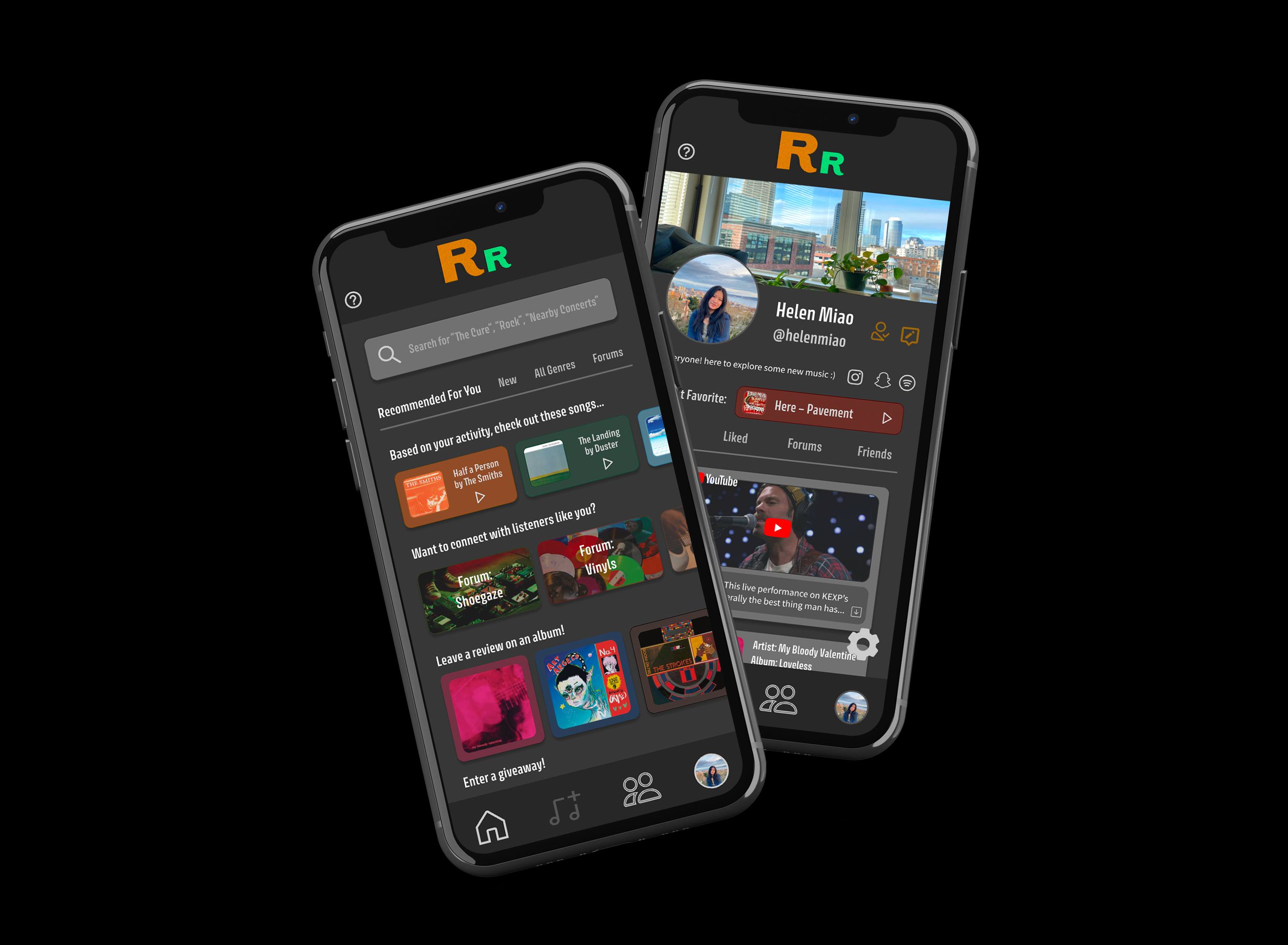
Initial Design of Explore Page
Explore Page:
After drafting the home screen, I moved on to the second, keeping in mind the issues I had with the home screen.
This was the final look of the explore screen.
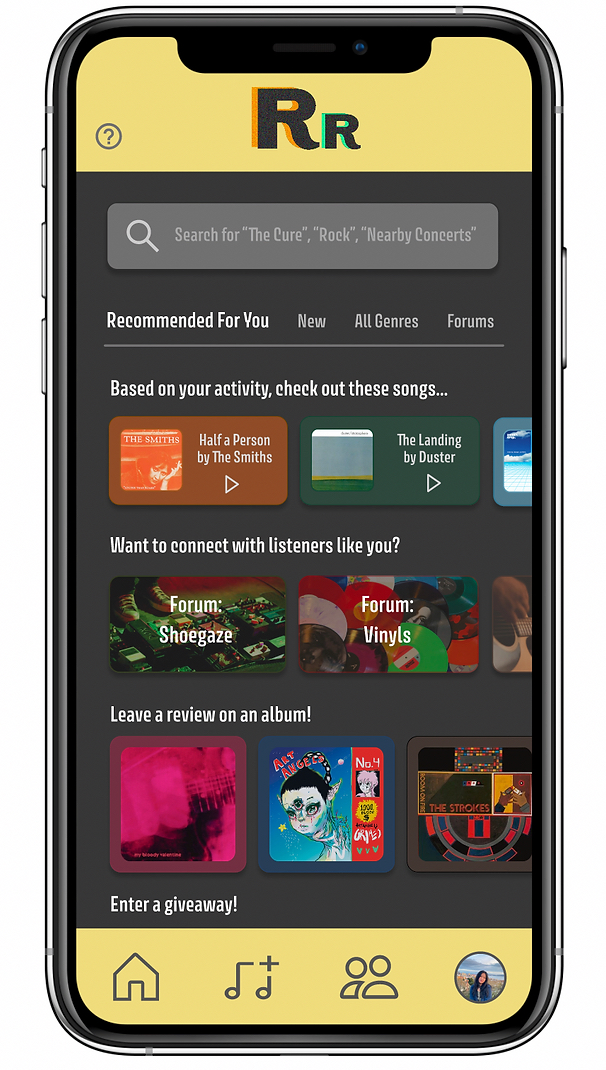
There are multiple tabs within this screen, allowing users to browse their recommended options and actions, view new media, see all music genres, and browse forums they may be interested in.
The recommended tab, especially, encourages more engagement within the app and keeps users active by allowing them to explore different forums, songs, etc. The ability to leave a review allows users to express their thoughts and have their opinion read and heard by others, helping users feel more impactful and influential.
To add more color, I made the containers the same color as the media included in them, but with a lower opacity.
After drafting the home screen, I moved on to the second, keeping in mind the issues I had with the home screen.
This was the final look of the explore screen.
There are multiple tabs within this screen, allowing users to browse their recommended options and actions, view new media, see all music genres, and browse forums they may be interested in.
The recommended tab, especially, encourages more engagement within the app and keeps users active by allowing them to explore different forums, songs, etc. The ability to leave a review allows users to express their thoughts and have their opinion read and heard by others, helping users feel more impactful and influential.
To add more color, I made the containers the same color as the media included in them, but with a lower opacity.
Initial Design of Friends Page
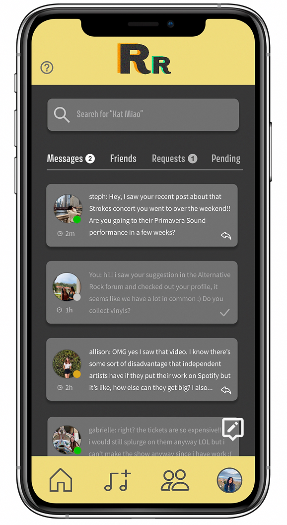
Friends Page:
Next, I moved on to the friends screen.
To keep this screen interactive, a count is used for the tabs Messages and Requests. Then, users can also track and see how many unread messages and requests they have received and check the corresponding tab.
I added active/away/offline statuses for friends so users can see who was recently active, which can encourage more activity.
Icons next to each message container show if a message has been delivered or offer an action to reply (directs user to an individual chat screen).
Initial Design of Profile Page
Profile Page:
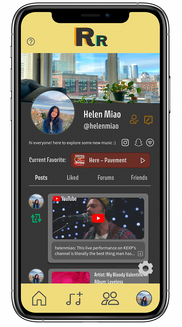
Then, I moved on to the Profile screen.
I added social media connections to Instagram, Snapchat, and Spotify to increase user interactions with each other.
Users can personalize and customize their profile name, picture, background, biography, and add their current favorite song.
Users can view their recent posts, posts/artists/songs/etc. they've liked, forums they're a member of, and a list of their friends.
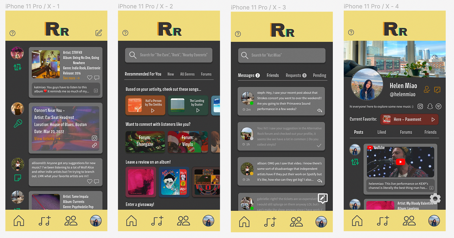

All four screens
Improving the UI
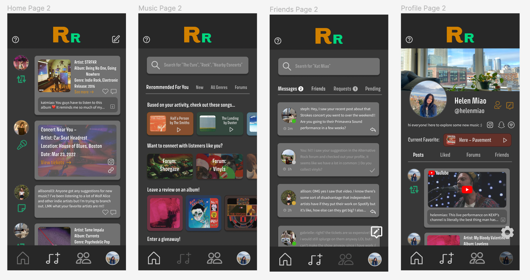
After considering aesthetics more, I changed the header and footer areas from the bright yellow to a black. This would make the interface feel more clean and nice to look at. To maintian visibility of the logo and footer icons, I modified/inverted the colors.
This could also be considered a “dark mode” in the app, if a light mode were to be designed.
This could also be considered a “dark mode” in the app, if a light mode were to be designed.
Final Prototype
Experience the Figma prototype here!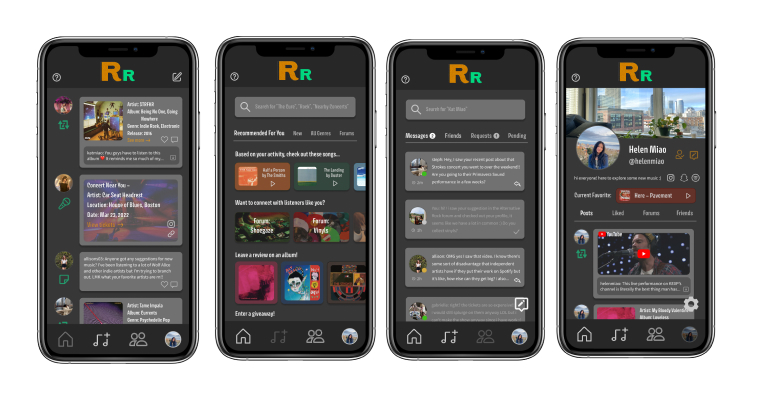
Takeaways and Next Steps
This was my first project designing an interface, and it made me think about what kinds of features an app could have to help first-time users and be easy to use. It also made me think more about accessibility and how I could improve my designs so that someone with poor eyesight, inability to type, etc. could use the app as well. This project encouraged me to think of how I could improve user engagement as well as activity.A few changes and considerations I want to use to adjust my designs when moving forward:
- App may feel a bit claustrophobic for users given the small distance between posts
- Some text, like on the explore page, might have low visibility for users with poor eyesight
- Some icons don't really match each other well
- Use of grey on grey may make the app feel dull, especially on the Friends screen
- However, I have already tested using other colors and it lowers the cleanliness of the app.
- Some contrast needs to be fixed (such as the new message button on the Friends screen)
- Adding an accessible settings button (currently only one on the Profile screen)
- Conduct user testing!
Moving forward in this project, making more designs of different screens would showcase the app's features and designs better. Creating both lo-fi and hi-fi wireframes and user flow charts would make the app's functionality and use much more clear.